Dividers sketch by David Fisher.
Every woodworker I know wants to get better at design. Yet it’s hard to carve out time to devote to it. Perhaps it’s because most of us go it alone. Design like any skill responds to our time and attention, but progress often comes in fits and starts.
I’ll be teaching a design workshop at Marc Adams School of Woodworking the week of August 27th through the 31st. It’s a chance to make a significant leap in your design journey. You’ll leave the workshop on a whole different level equipped with tools to develop your design skills with purpose.
Here’s a link for more details.
Note: Both Jim and I have curtailed our teaching schedule to devote more time to our research and writing. This is the only workshop I’ll be offering this year.
George R. Walker

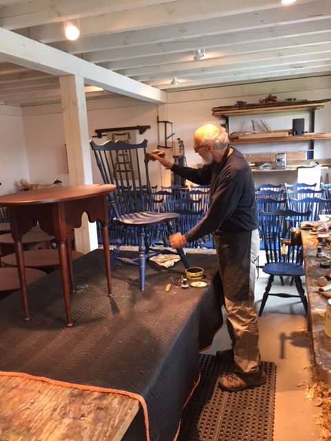
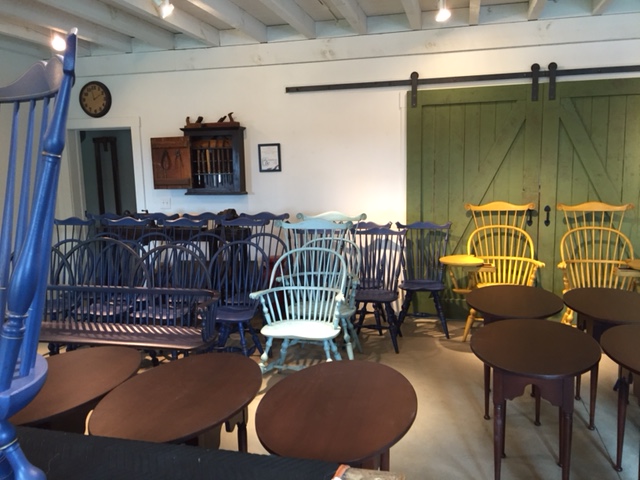
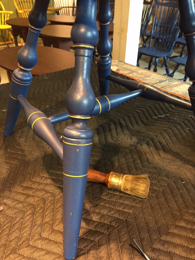
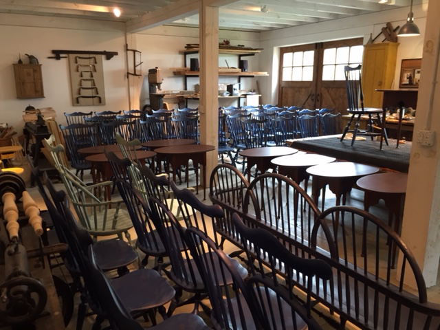 He’s been making chairs for a living for over 40 years and still passionate about the craft. That makes him a hero in my book.
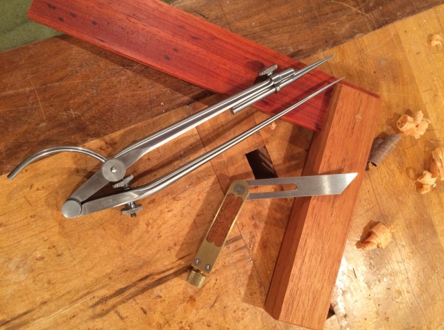 I’m excited to announce the launching of a new website,